Hi, I’m Feyi! ✌︎
a graphic designer and fine artist.
Most Recent Projects
Documentary Movie Poster
Production and process for a music documentary.
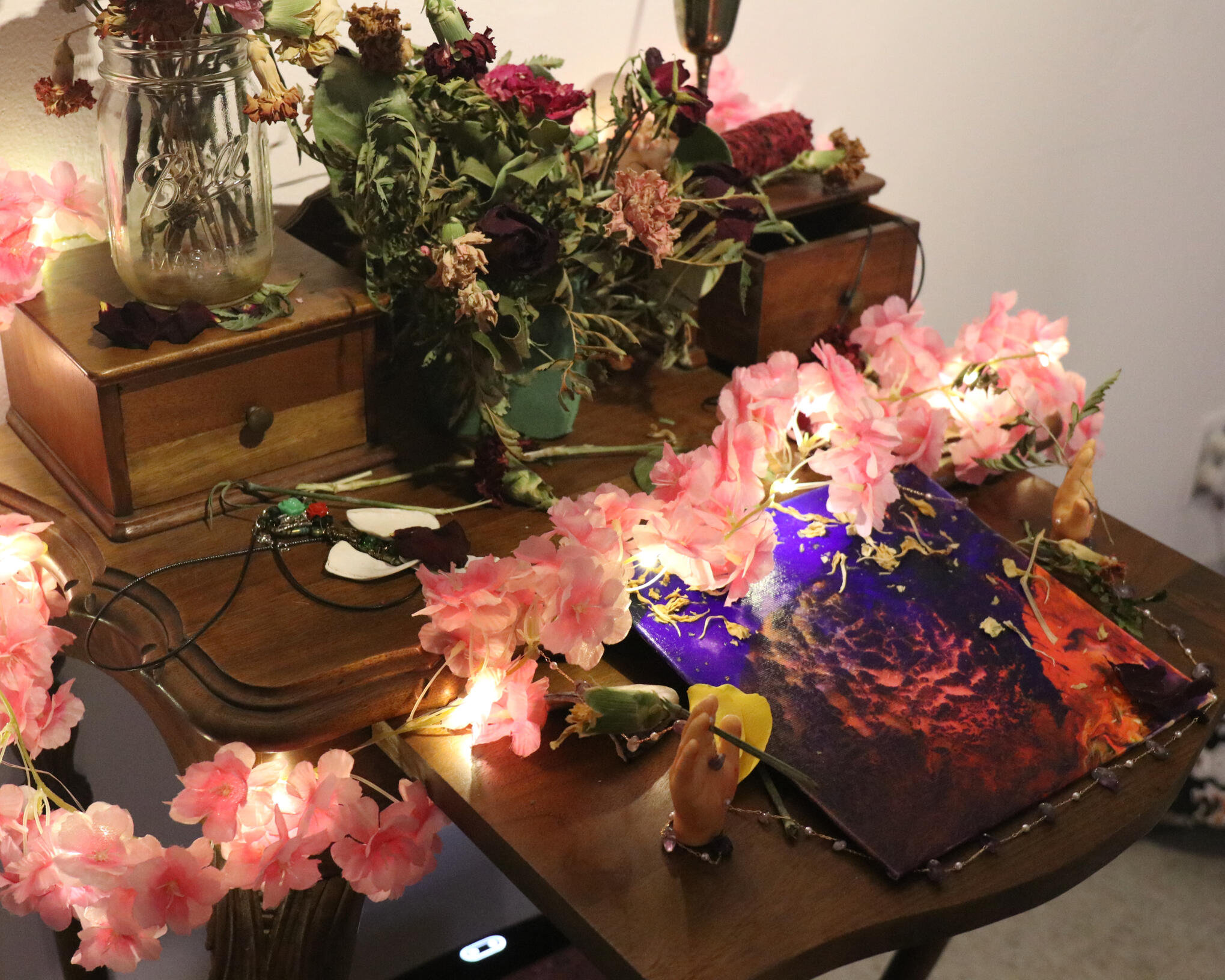
2026 Senior Art Fair Showcase
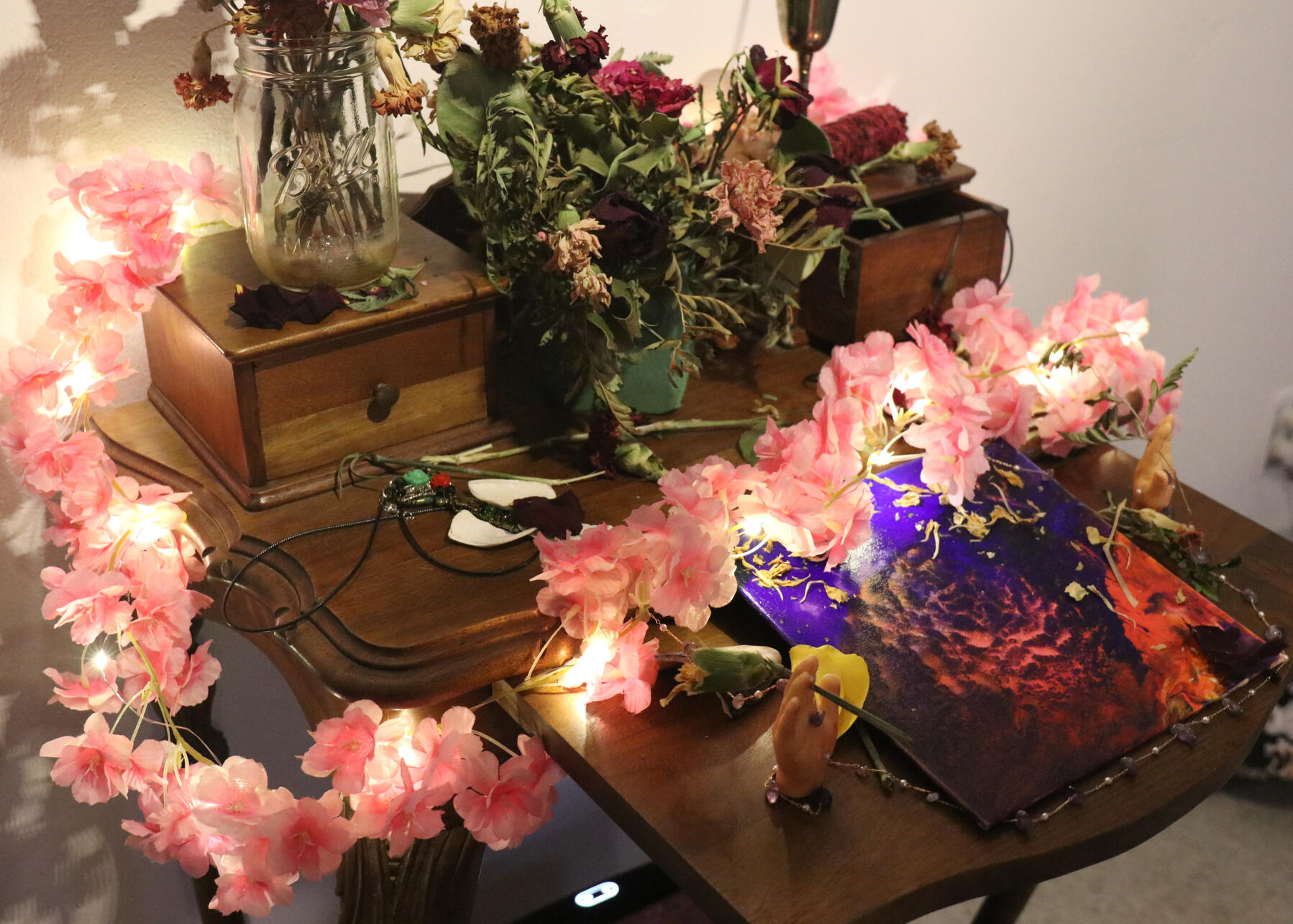
Final capstone for my BFA program: a shrine of found objects and abstrcact paintings.
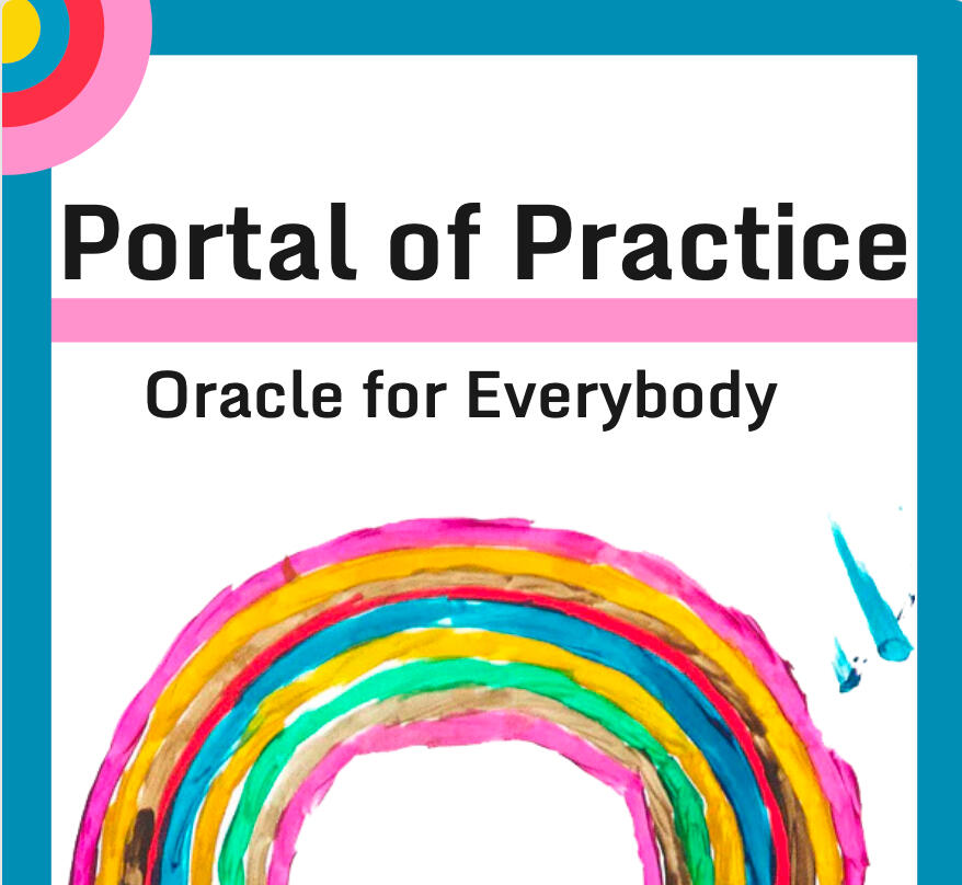
Oracle Card Deck Planning
Created a calm set of cards for a non profit rooted in inclusive identity.
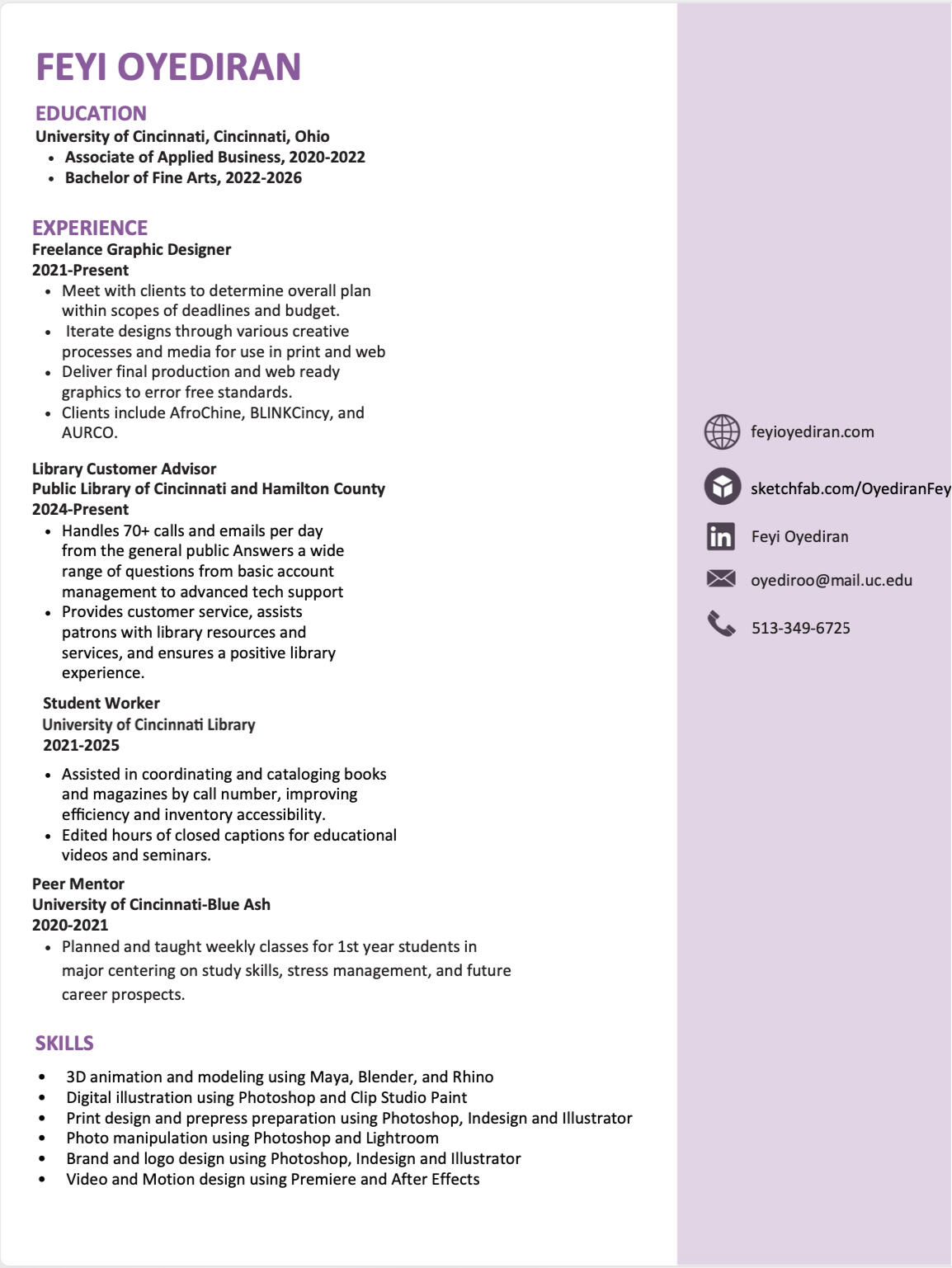
Feyi Oyediran
pronounced: (faye oh-yed-ur-an)
she/herFeyi Oyediran is a graphic designer and artist hailing from Cincinnati.
Her focus is in branding and motion design. She also has a passion for animation and illustration.
She obtained her BFA at the University of Cincinnati College of Design, Architecture, Art and Planning.
You may reach her at:
513-349-6725
[email protected]
Spring Capstone 2026
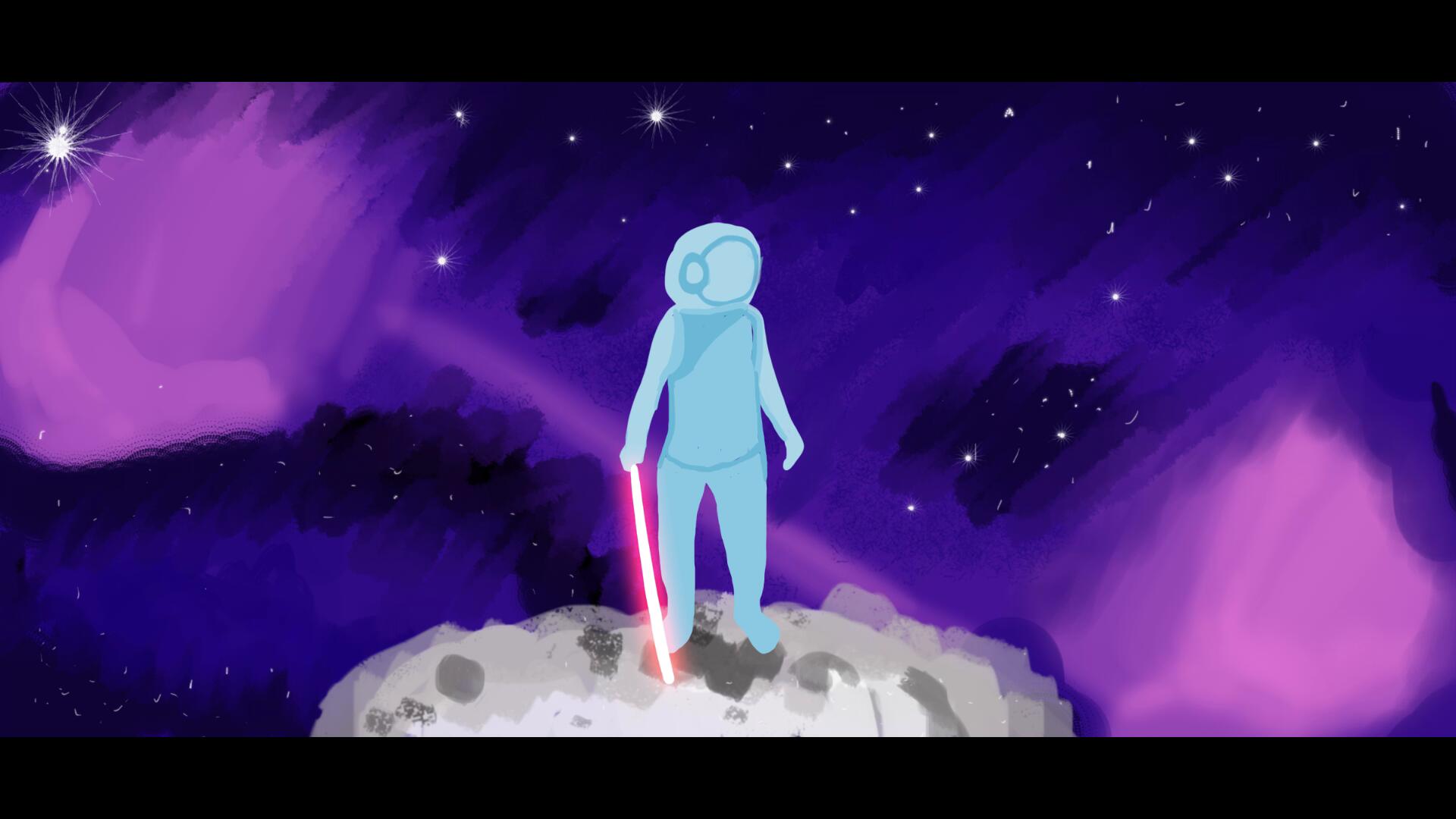
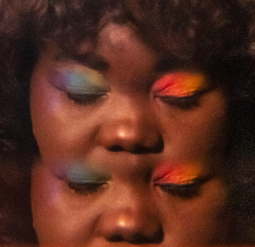
For my BFA Capstone, titled Dearest Girl, Your Altar Glows Pink, I created a solo show featuring my abstract art and a shrine using found objects.
I explored the female body through the lens of hyperfeminity and horrifying exaggeration. I was particularly interested in what happened when beauty was pushed to excess, and when it crossed the threshold into the horrors of being trapped in a flesh vehicle. My work involved digital illustrations, abstract paintings, and installation to bring pieces of this beautifully violent world into reality.
Additionally, I created original characters in a world oscillating between uncanny beauty and wondrous dread. When my girls are no longer performing the traditional female gender, what else is there? This transformation of the female form is not simply violent; it is transitional, marking the possibility of reclaiming power through change. My characters are icons, both worshipped and objectified. By pairing devotional imagery with bodily transformation, I highlight the contradictions embedded in idealized femininity.Ultimately, my practice interrogates the female body in art. I invited the viewers to consider: Is it worth conforming to the idealized form, or can there be liberation and comfort found in the pain of tearing it apart?
Portfolio
Graphic Design
Projects
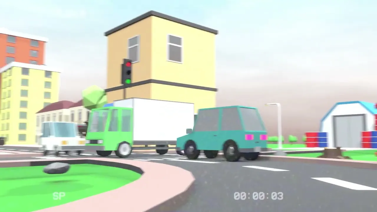
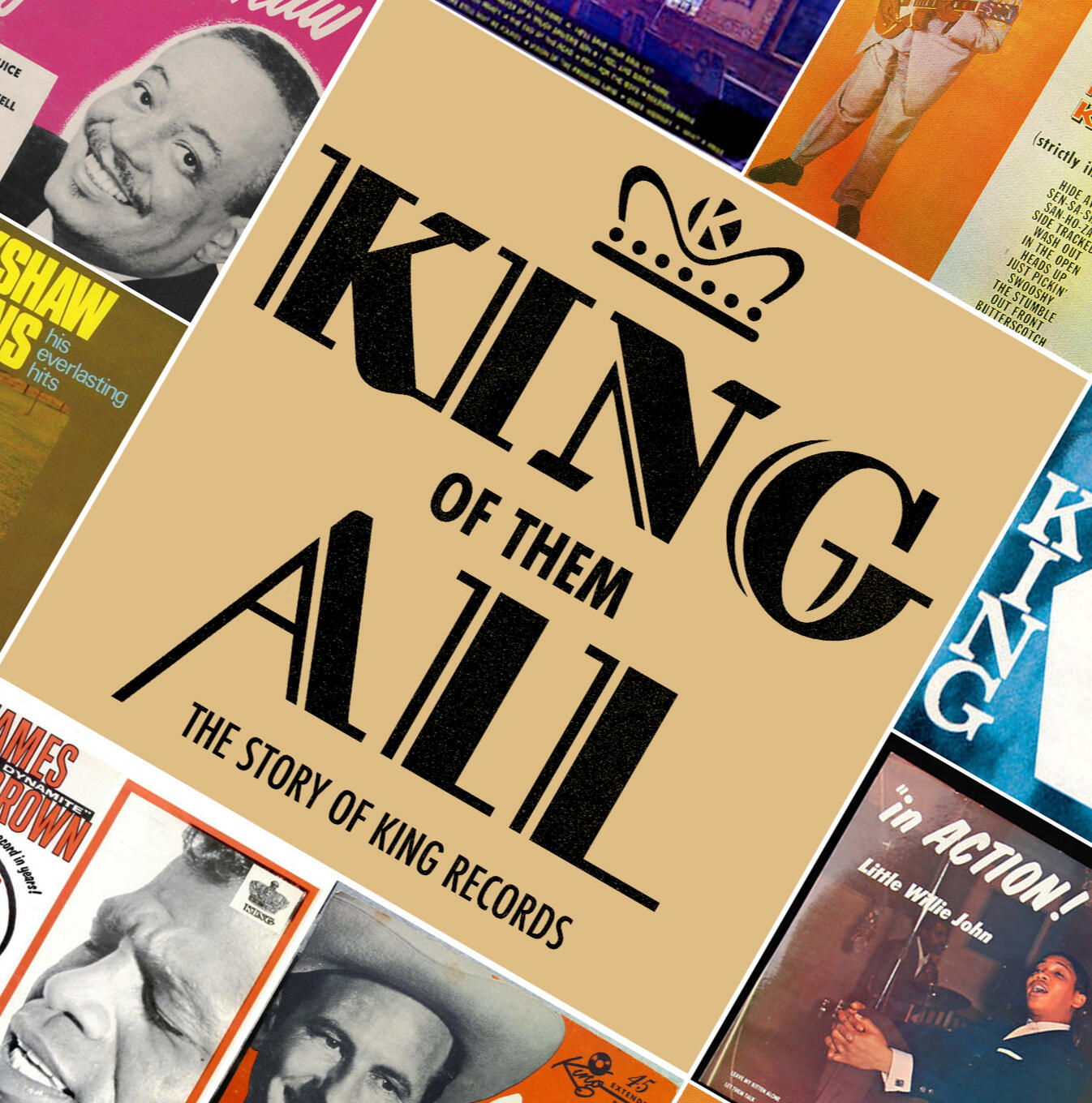
King of Them All: Documentary Poster
I designed the poster for the PBS documentary King of Them All: The Story of King Records.Since the focus of the film is a record producing company, I wanted the poster to feature a variety of albums to induce curiosity in the viewer.I chose a diagonal grid system, inspired by the log in splash screen for Netflix. I wrote a Python script to quickly square crop and lay down all the album art in a grid, then adjusted them in Photoshop.
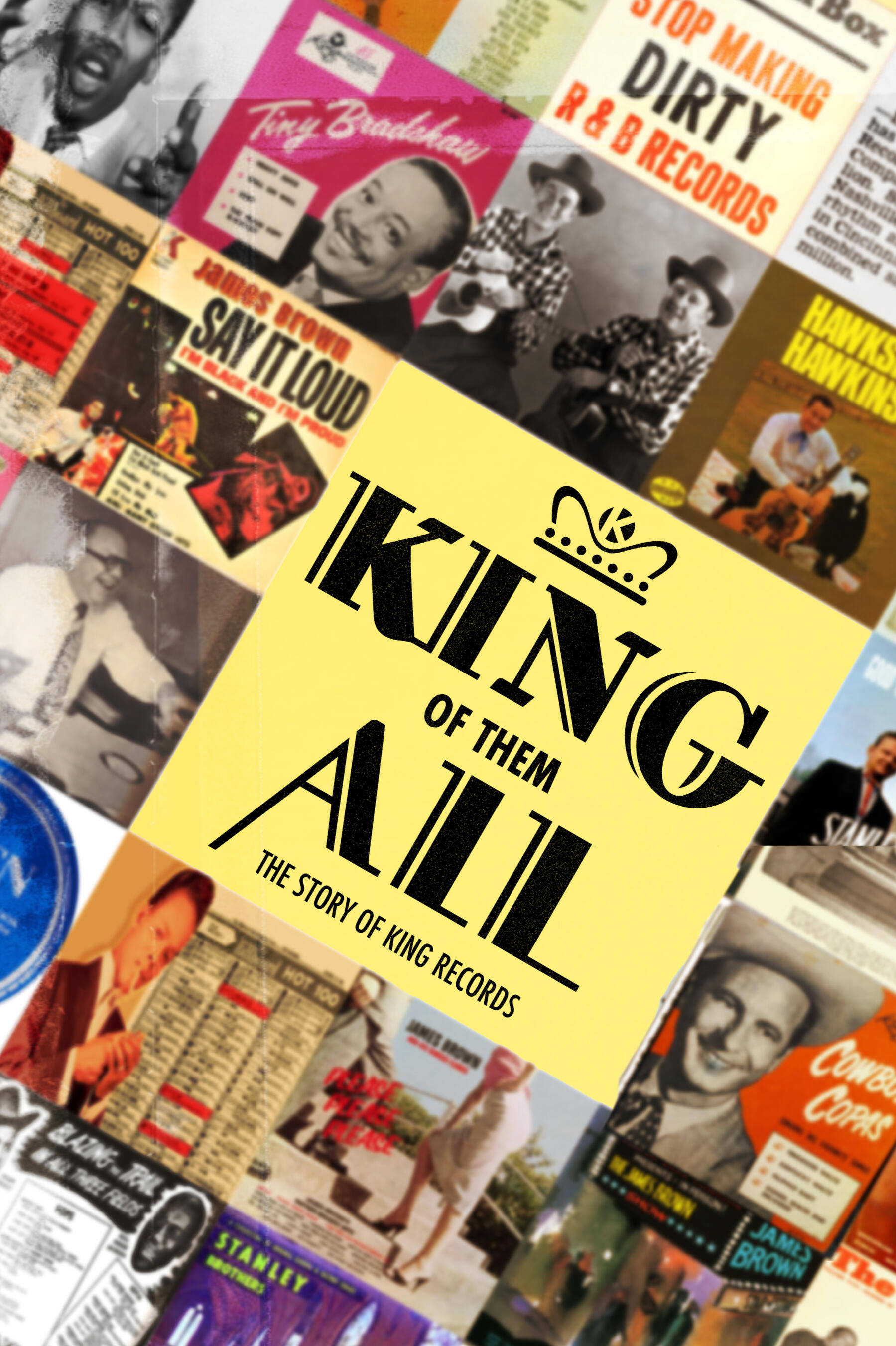


For the final poster, I slightly blurred the album art to emphasize the title. Most of the album art is warm toned, so I picked a warmer, brighter yellow to match.

Oracle Card Deck
I was approached with the task of creating a playing card deck and booklet cover for a non profit set of oracle cards. I focused on simplicity and readability of the design, with a color palette that was reminiscent of the main art graphic they wanted me to use, a ring with various colors.


Animated Wedding Invitation
I was approached by a client for the request of making an animated wedding invitation.
After some back and forth, I composed a draft in After Effects based off of the animations they were hoping to see.

I put together 3 palettes for the client to choose from. Their instructions were for fall themes, but nothing too "stereotypical". With this in mind, I shied away from reds and elected to pick out more earthy and muted colors


Afterwards, we talked about some more specific elements they wanted:
Autumn themed colors
White Flowers
Tighter pacing of the animations
Some adjustments to the typography
"Rainfall of envelopes" theme for the gifts
Music track requested
Text in Español


All of the graphics were put together in Illustrator, and then composed in After Effects.
Client reported back very pleased with the invitation. The most interesting challenges I took away from this project was the language barrier. Making sure the typography worked in another language was my priority, and we were both pleased with the outcome. An animated wedding invitation is slightly unorthodox for English speakers, therefore most of my examples I used to construct the first mockup were also in another language. Yet I was able to get the gist of it and teach myself what to look out for and what elements to add.
AURCO Brand Design
In 2021, AURCO, an organization for regional campuses in Ohio, approached my class for possible branding for the 2023 conference. We were given the tagline "Resilience and Reinvention".
After a color scheme, typography, texture, photos, and a logo were decided, I worked with others in a group project to not only design posters, but also promotional ads and ephemera guests would receive upon attending the event.


Moonjelly Brand Design


For one of my final projects, we were assigned to choose a "Spirit Animal" to develop a logo and some branding around. I chose the moon jellyfish because it is one of my favorite animals, and I love aquatic themes. Moon jellies don't have the longest tendrils like other jelly fish, so in some sketches I played around with the shape if the tentacles to make it more interesting.
Referencing actual pictures, I simplified the jellyfish and kept the iconic mark on the top of their head for recognition. It is the same reason I added the crescent moon. The brand I ended up doing was a skincare brand, because skincare products are becoming more trendy, with things like jelly face masks. I wanted the brand to be sophisticated, yet something fun you would see advertised on Soko Glam.
I imagined my hypothetical target audience to be 20-30s young women, the usual consumer of skincare. I colored the tentacles differently to lead the eye and add variety in the logo.


Vibrato Poster System


Digital Art


Animations